International Children’s Media Center
The ICMC transforms education and inspires children to love learning. They accomplish this by humanizing the way Children use and engage technology. Their programs create safe, intentional spaces for participants of all ages to build trust, compassion, and acceptance. This life-affirming approach is a cornerstone of the ICMC’s mission.
The ICMC needed a redesign of their homepage and creation of two additional pages to improve user engagement and accessibility. My role involved user research, prototyping, and testing to create a more intuitive and user-friendly interface.
Project Overview
PROBLEM
The original ICMC homepage had several issues that affected user experience:
High bounce rate
Overwhelming content structure
Lack of clear calls-to-action
SOLUTION
Redesign the homepage to better reflect ICMC’s mission and offerings
Design two additional webpages that mirrored the consistency of the homepage and brand
ROLE
UX Designer
TIME
2 Months
TASK
Improve website engagement to increase involvement
CONTRIBUTION
A/B testing, Affinity Mapping, User Flows, SEO Analysis, Sketching, Figma Wireframing, Usability Testing, Prototyping
Empathize
Research
We conducted remote user testing with a diverse group of parents and educators to understand their needs and pain points. Key insights included:
Difficulty finding information about upcoming events
Confusion with the site’s navigation structure
Overwhelming amount of text and images
Methodologies Used:
Competitor Analysis
Usability Testing
Affinity Mapping
Define
Prioritize the Problem
Define
Ideate
Exploring Solutions
User Flow
Sketches
Prototyping and testing
With initial ideas on paper, the next step was to validate design decisions and ensure that the app's structure and flow would be intuitive for our users. Before diving into the visual design phase, we needed to prioritize functionality. To achieve this, we opted to develop a mid-fidelity prototype, allowing the team to test the design with real users and address any critical issues before incorporating branding and visual elements
From ideas to design
Mid-fidelity Wireframes
Using figma, our sketches were then pieced together into a mid-fidelity wireframes.
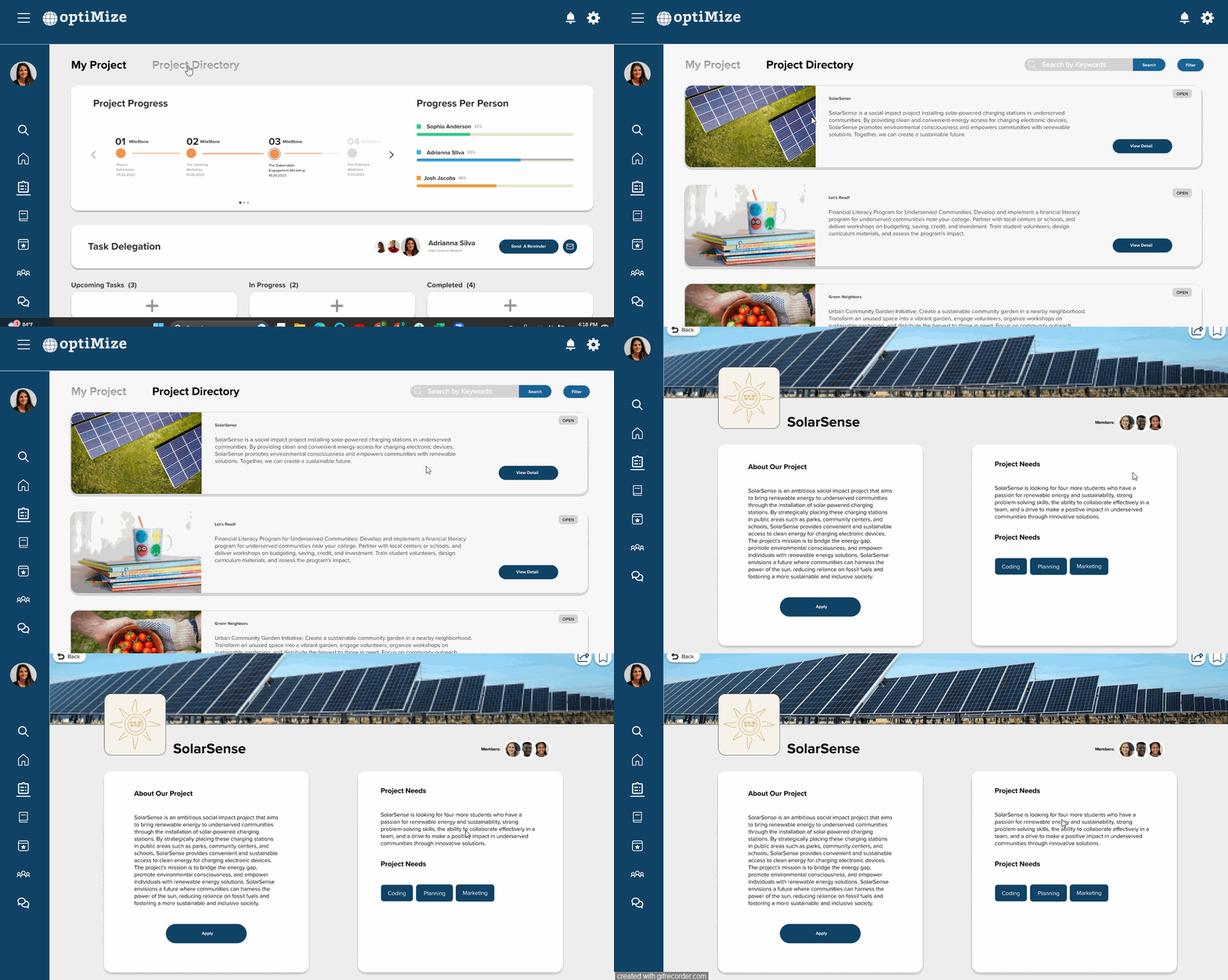
project directory
student profile page
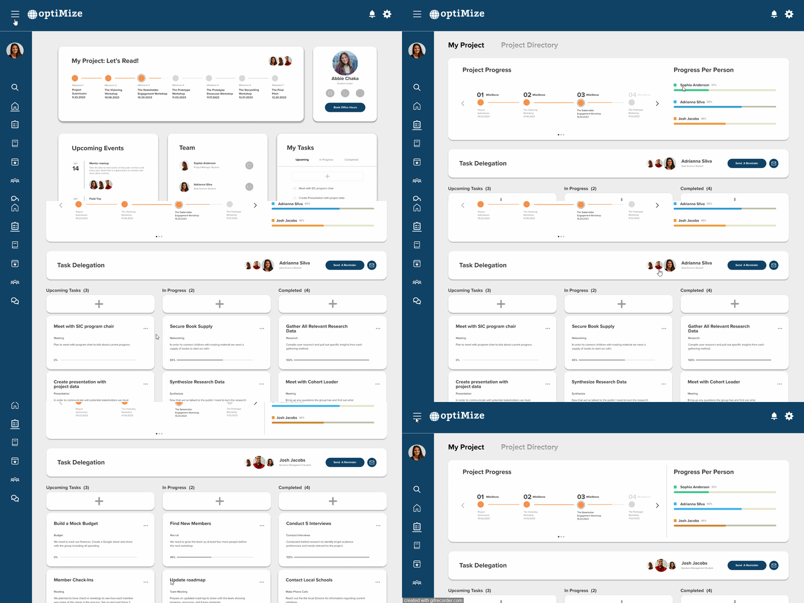
project dashboard
Usability Testing
We conducted 5 usability test sessions through usertesting.com. During these sessions, users were encouraged to verbalize their actions, thoughts, and emotions as they engaged with the prototype, striving to accomplish predefined tasks. The goal was to put the tester in Adrianna’s place to evaluate teammate progress, search for a specific project, and find a mentor through the directory.
Key Revisions
Taking everything we learned from the tests we were able to pinpoint three major flaws. Each had a negative impact on usability and by catching them early in the process we saved time on our overall design. It’s funny how what might seem obvious after testing didn’t seem so obvious during design.
Revision #1
The pie chart used to visualize individual teammate progress was confusing to some users.
Solution
Replace the pie chart with a bar graph
Revision #2
When searching for a specific project, users had trouble finding the project directory.
Solution
Move the project directory from the people tab, to the project tab
Revision #3
Users were unsure of what keywords were available
Solution
Provide a filter pop-up with clear filter options
Track Project Progress
View project goals and timelines
Delegate tasks to other members
Track teammate progress
Final Prototype
View other projects
Connect with other student leaders
Find inspiration from other teams
Discover A Mentor
Browse the entire Optimize mentor database
Filter to find mentors that fit your needs
Reach out and connect
Having experience working in college group projects and in a professional setting, this project really stressed the importance of leaving your assumptions at the door. Creating a persona and using that persona to guide our every design decision was crucial in building a product that would achieve our initial goal of helping students in the OptiMize program.
I have also been out of school for close to 7 years now and in that time technology has changed a lot. It was fun talking to current students and gaining insights on how their experience has differed to mine.
Reflection
Next steps
Continuous testing
While we were able to conduct some usability tests, it is important to continually validate the design choices made. It’s also smart to design in tracking measures pre-development to monitor user engagement, satisfaction, as well as a means to report errors.
Product Launch
Once built the platform can finally reach the hands of optimize students and faculty, hopefully before the next semester begins. Tracking initial metrics will uncover new usability issues that need to be addressed by severity.
Project handoff
The project then is handed over to engineers and feasibility, budget, and timeline are discussed in relation to the design features. It may also be presented to stakeholders in the program to gather additional feedback.
Additional features
Once up and running, the team will be able to collaborate on features that can be added or new iterations of additional features. A/B testing can be administered along with additional usability tests.
Browse another project
A Foot in the Door


